Drowning in scattered, unreadable data?
You’re working hard, but your charts are confusing, overwhelming, and don’t deliver insights when you need them most.
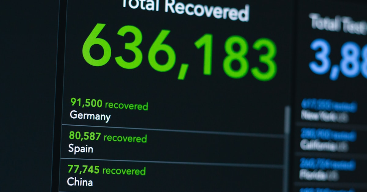
It gets frustrating when raw numbers pile up with no clarity.
You know that making smart, confident decisions is only possible when your information is truly organized and visualized the right way. The right charting tool helps you break through the clutter so you can see clear, actionable patterns and trends.
Intuitive dashboards, real-time collaboration, and customizable chart options are the features that can finally turn chaos into clarity for you.
In this article, you’ll discover the 10+ best charting software options to easily convert data overload into sharp, meaningful visuals—so you can make decisions faster and with more confidence.
Gain expert tips to help you choose exactly what fits your team and your data goals.
Let’s get started.
Conclusion
Drowning in complex data every day?
Choosing the right charting software can feel overwhelming with so many options and features to compare—especially when your business relies on actionable insight.
That’s why this curated list highlights the most intuitive and powerful solutions designed to turn your raw spreadsheets into clear, compelling visuals—helping you reach data clarity faster.
Here’s our top pick for you.
Tableau stands out as the #1 choice thanks to its enterprise-grade analytics, robust integrations, and a drag-and-drop interface that makes even massive datasets easy to visualize and understand.
Power BI and TradingView follow close behind—both are strong contenders, especially if you’re tied to the Microsoft ecosystem or focused on trading. But for the best charting software that adapts to any industry or use case, Tableau leads the pack.
Ready to make sense of your data? Request a demo of Tableau today.
Unlock smarter, faster decisions for your team.