Are your reports losing their impact?
Drowning in a sea of spreadsheets and scattered data can stall your business decisions and blur your team’s priorities.
Messy metrics lead to missed opportunities, wasted time, and confusion about real performance. You crave clear insights, not chaos.
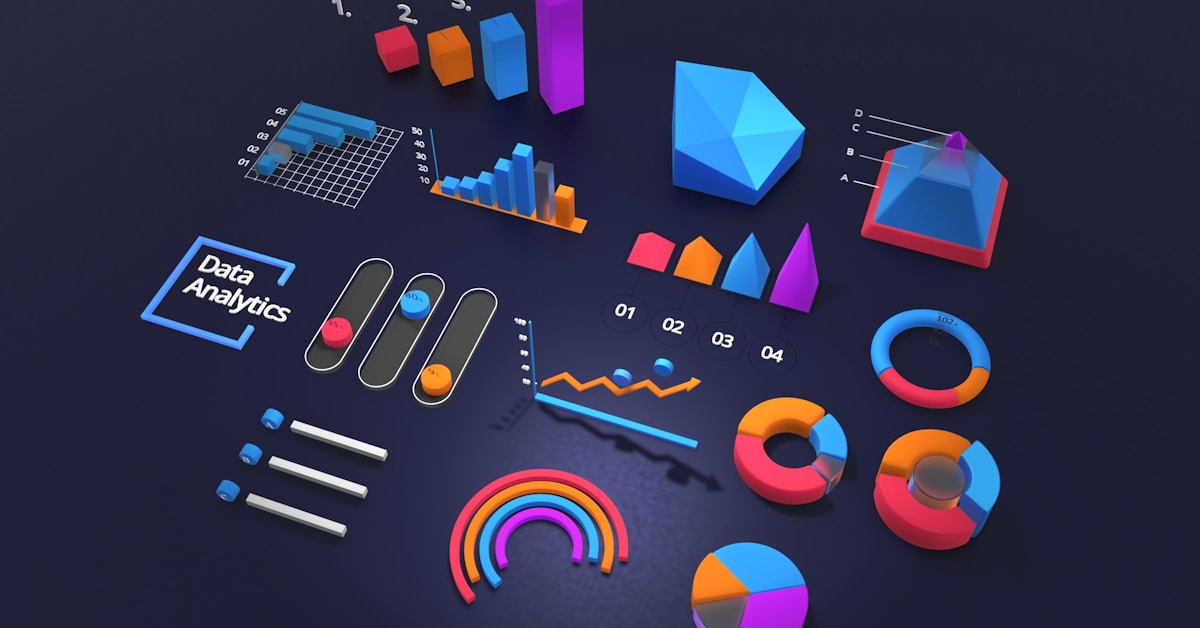
You need an easier way to keep tabs on every data point, spot meaningful trends, and share actionable insights that drive faster decisions. The right dashboard software can provide up-to-date visuals, interactive features, and unified data views so your team always knows what matters most.
With real-time dashboards, user-friendly customization, and integrations, these tools can transform overwhelming information into a roadmap for smarter action.
In this article, I’ll break down the 10+ best dashboard software for business owners and leaders looking for a sharper way to command data and make confident calls.
You’ll discover how to save time, gain clarity, and stay ahead.
Here are your top dashboard picks.
Conclusion
Struggling to make sense of tangled data streams?
Finding the right dashboard software can overwhelm even the most data-driven teams, with so many features, integrations, and visual options to consider.
With the right dashboard platform, you gain centralized, actionable insights that help you turn raw numbers into clear business decisions—fast.
Here's what stands out as the best choice.
Tableau leads our roundup because its intuitive platform helps you simplify complex data and empower your team to make smarter moves every day.
While Microsoft Power BI offers seamless integration for Microsoft users and Zoho Analytics supports growing small businesses, Tableau stands out as the best dashboard software for enterprises that demand powerful analytics, flexibility, and scalability.
Supercharge your team’s decision-making—start your free 14-day Tableau trial today.
Gain clarity, speed, and confidence in every decision.